"Before and After" is the
98th tiny book published by the Fiji Island Mermaid Press. It's not my usual practice to reproduce the entire book on the blog right after it's been sent out to
FIMP Book of the Month subscribers, but this one is dealing with the ongoing oil spill, and it seems to make sense to put it out there while that horrible situation is still unfolding.
I'm happy with this month's book for a couple of reasons. Back in my graduate school days at Indiana University I studied concrete poetry with
Mary Ellen Solt, and this book puts some of those ideas to use. She was a great professor - I remember her passing out her syllabus in two week increments over the course of the semester, as she was putting the class together as she went along, being responsive to what was happening with the students. Pretty amazing for someone who was near the end of a long teaching career. If she were still around I'd send her one of these. . .
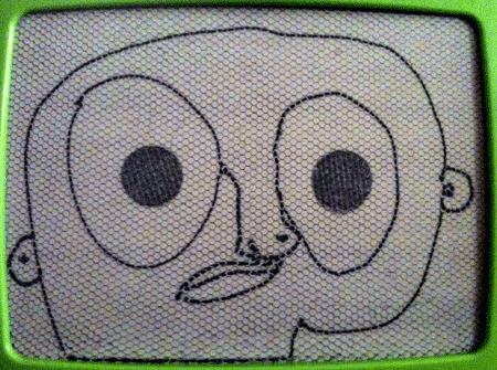
I'm pleased with the way this book translates to xerox. As a printmaker I always feel like my work should take advantage of the peculiar strengths of whatever medium I'm working in, and that includes xerography. I don't always achieve that, but in this case the xerox did nice things to the pages that include both laser-printed and rubber-stamped text. Things that I wanted it to do, like increasing the contrast and making them less distinct from each other, so that the "OIL" stamp takes a few more seconds to read as something other than just pattern and noise. In the xerox, you're much more likely to see the page as a picture first, before you start reading, than you do with the "printing plate" from which the xerox is made. It's nice when things like that actually work out the way you hoped they would.
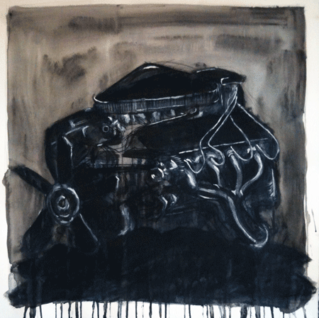
And I'm happy that the front and back covers are full participants in the little drama of the book. I especially like the back cover - I sacrificed the usual FIMP logo for the drama of the black swallowing up the page.
So, anyway, I'm happy with this one, and that's why. I wish the subject matter were something less awful. There's something that makes me sick.