Thursday, July 31, 2008

Optical Realities


Remember when you were a kid and figured out "optical illusions"? Not necessarily how they worked, but the kind of thing to look for? You grew suspicious about trusting your eyes when it came to which this or that was bigger or longer or closer? Sort of like when you learned that if someone tells you a story starting with "So this guy. . ." it's going to be a joke. Well, that learned-wariness was what I was reminiscing about when I made "Optical Realities".


This little book had illustrations designed to trip up the smart-ass thirteen year-old in all of us that is wise to the way of optical illusions. Despite everything your cynical, illusion wary mind tells you, in these little images your eyes actually get it right. If it looks bigger, it is bigger.


"Optical Realities" was a FIMP "Book of the Month" back in 2004.

Monday, July 21, 2008

"Grid Action", and the Book of the Month


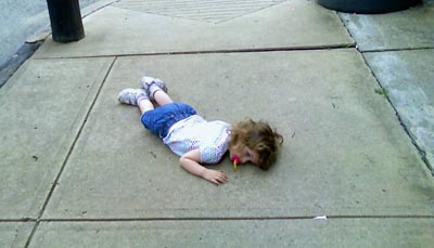
In a performance piece created multiple times throughout the exhibition, Snyder throws herself to the pavement. This gesture, despite its somewhat casual quality, always succeeds in making a powerful visual impression.

The fluid form of the artist’s body plays dramatically against the rigid modernist grid. Defying the deadly uniformity of these concrete squares, Snyder brings life to the barren sidewalks, ultimately creating images of healing and hope.


Text and image from this month's FIMP Book of the Month, an exhibition catalog of my daughter's first solo show, documenting sculptural work and performance pieces created in our urban residential Pittsburgh neighborhood.

Wednesday, July 16, 2008

Miss Dora learns to Draw


I have a small collection of antique-ish drawing books for kids, my favorite by far being "What To Draw and How To Draw It" by E. G. Lutz. Everything about this book pleases me. The title alone is wonderful - it sounds like you've got a whole career plotted out for you in this one slim volume! It's full of those drawing diagrams that give you a step-by-step path for drawing whatever it is you need to draw. Here's a beautiful example:


They tend to leave a step out between the next to last and the last drawing - that step would probably look something like this:

(learn to draw)


I've often thought that a kid that takes these things seriously must get awfully frustrated awfully fast. But I love 'em.

One of the many things that makes E. G. Lutz's book one of the best in this genre is that he's pretty upfront about the fact that he's really not teaching you everything you need to know. On page 3 of the book you find this:


He scatters beautiful little images like that throughout the book. It's wonderful.

But, anyway, after the previous post, I was thinking about what it must have been like to do schoolwork with a dip pen. Besides the invitation to chaos that inkwells must have been, the daily practice of training your hand not to make a mess with that tool must have had some side benefits. I noted down below that I think our handwriting has gotten collectively worse due to the nature of the tools we use these days. The fact that they're so easy to write with is great, but maybe we've lost a little something by not being forced to work with a more demanding instrument.


I'm just wondering - if the person who wrote Miss Dora in 1910 might have found making this drawing:


a little easier than a kid today who doesn't have such wonderful control over a pen?

That "how to draw a bird" diagram is one of the really nice ones, by the way. Making these drawings is a lot of fun, actually, as long as you can set aside anything you've ever been taught about drawing and just enjoy it.

Monday, July 14, 2008

antique technology

One of the many reasons I'm fond of printmaking is that a skillful printmaker is someone who has mastered a bunch of really antique technology. The equipment and techniques used by printmakers were once the "state of the art" methods for reproducing images. As each method of creating multiples was replaced by something more efficient and cost-effective (I'm not saying "better" here!), it was left to the artists to celebrate whatever unique qualities were found in the images made by the now obsolete technology. Which is why we're still making relief prints. Liberated from commercial considerations, the medium could be explored solely for its beauty. So, with this in mind, I was wondering why our collective handwriting has gotten so crappy?


Regardless of the gravity of the situation, I could never have signed the Declaration of Independence with the flourish of Benjamin Franklin, much less Mr. Hancock himself. And looking through any stack of old postcards, I'm frequently impressed by the quality of the handwriting. These aren't "calligraphers" - these are people who have trained their hands to do something that most people don't do anymore. . .


The obvious place to look is probably the tool. All of those variations in line width are only possible with a chiseled nib. But I think that the training of the hand was even more important. The fountain pen required a care and deliberation to use that became unnecessary when the disposable pen, with quick-drying ink, was introduced. It's strange to think that our hands can have become so much more clumsy, at least in this one area, because of the introduction of a more efficient tool.


So that got me thinking about other things we don't do anymore. And one of them is draw. Is drawing an antique technology? By this I mean, has drawing lost its utilitarian function, and become something used solely for its intrinsic visual qualities? This lovely little drawing by Frank Lloyd Wright was the best way to visualize his plans for those pieces of furniture at the time - drawing was the way you got from idea to object for the architect. I was reminiscing about my undergraduate days, when the art studio was right next door to the architecture school. Those architecture students were some of the hardest working folks on campus, and they were frequently up all night drawing. I wonder if their all-nighters are now spent in front of a computer screen?

So here's my question, prompted by discussions on Steven LaRose's and Mary Addison Hackett's blogs: How does the gradual disappearance of the utilitarian functions of drawing affect the way we see artist's drawings? As drawing plays less and less of a role in advertising, architecture, technical illustration, medical illustration, and the like, does the viewer lose the sense of what is typical of competent drawing, and thus have a skewed sense of what the artist is attempting in his or her work? If an artist creates a skillful rendering from direct observation, does the element of craft involved overshadow whatever peculiar qualities unique to that artist's vision are on display?

I'm not questioning what I still believe to be the enormous value of drawing in the training of an artist, or as part of an artist's practice, or the quality of artist's work that is drawing-based. I'm just wondering if the diminishment of drawing as a practical skill in the commercial world creates a different experience for the viewer. And, on top of that, does growing up in a world where drawing seems like an exotic practice of an eccentric few affect the future artist?

Is drawing antique technology?

Friday, July 11, 2008

Before and After


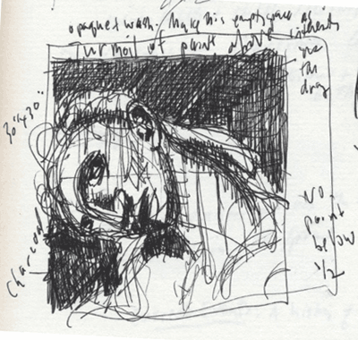
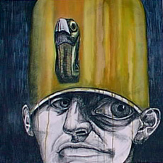
This week's theme at Ten Thousand Pixels was the sketchbook, and my post for today was a scrap of a little thumbnail drawing I did for the drawing/painting below. It amused me to see the two of them together, the initial scratchings and the finished product, so I thought it might amuse you too. You could certainly make an argument that the thumbnail sketch is the livelier of the two images. . .


These heads are from a series of "portraits" I made after my Existential Theater drawings. You can see a few of them here.

Pharaoh


My favorite was always this little Pharaoh.